
IKARUS 3D — Website Redesign
Bringing ideas to life in 3D.
A landing page redesign for a 3D visualization company—restructured to make a technically complex offering easier to understand, easier to explore, and more convincing for B2B audiences.
Role
Timeline
Tools
UX/UI Designer
1 Week
Figma · Blender · Illustrator · Photoshop

The Prelude
A good website isn't only about what it shows.
IKARUS 3D builds 3D models and immersive digital experiences for brands operating in the virtual market. Its work spans product demonstrations, virtual try-ons, VR experiences and other 3D applications.
The redesign started with a simple question:
How can a technically capable 3D company communicate its value with the same clarity and confidence as the work it creates?
The existing landing page already had a strong foundation. The visual language was relatively minimal and the core content was useful. But the experience wasn't always connecting those pieces into one coherent story.
This wasn't a redesign for the sake of making the website look different.
It was a redesign of how the story was told.
The Landscape
The existing experience
The original landing page had the right ingredients:
3D work.
Services.
Clients.
Process.
Testimonials.
Contact.
But the relationship between them wasn't always clear.
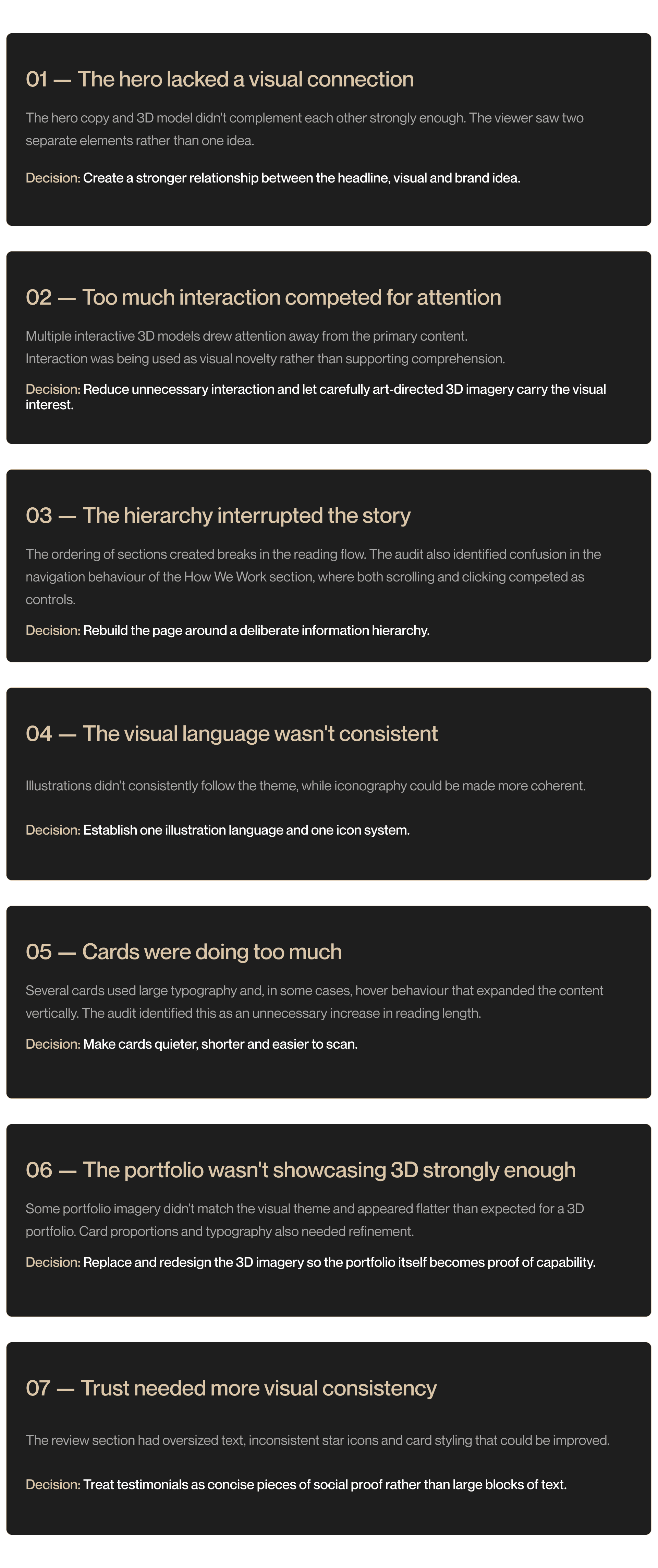
The UX audit identified issues across typography, hierarchy, interaction, imagery, cards, portfolio presentation and visual consistency.
The biggest problem wasn't a missing section.
It was the lack of a clear journey through the sections.
The Audit
When good content doesn't create a good experience.
I looked at the existing landing page section by section, focusing on what could interrupt comprehension, attention or trust.
The Opportunity
The audit revealed something important:
The content wasn't the primary problem.
The page already contained many of the things a prospective B2B client would want to know.
The opportunity was to connect them.
From:
What does Ikarus offer?
To:
What do they do → Why should I trust them → How do they work → What have they made → How do I start?
That became the foundation of the redesign.
The New Structure
Designing the journey before designing the interface.
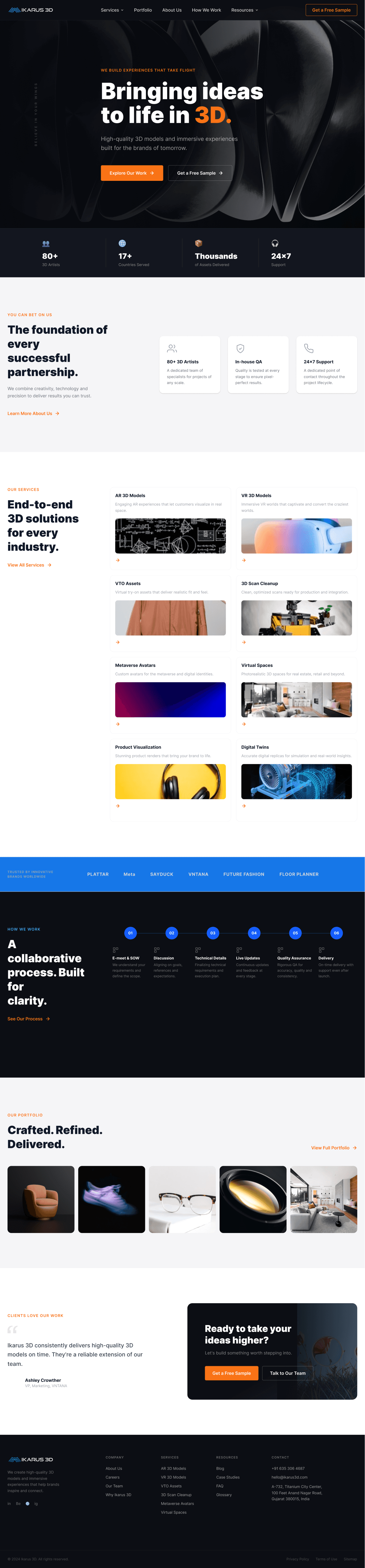
The page was reorganized into a clearer sequence:
01 Header
02 Hero
03 You Can Bet On Us
04 Our Services
05 Our Clients
06 How We Work
07 Reviews
08 Blog Highlights
09 Get Started CTA
10 Office Location
11 Footer
Why this hierarchy?
HERO
Job: Tell me what Ikarus does.
YOU CAN BET ON US
Job: Give me a reason to trust them.
SERVICES
Job: Show me what they can actually do.
CLIENTS
Job: Show me who already trusts them.
HOW WE WORK
Job: Remove uncertainty about the engagement.
REVIEWS
Job: Reinforce credibility with real experiences.
BLOG
Job: Demonstrate expertise.
CTA
Job: Convert interest into action.
LOCATION
Job: Establish physical legitimacy.
FOOTER
Job: Provide navigation and contact paths.
This hierarchy was defined specifically to create a more consistent flow—from understanding the company, to exploring its capabilities, to building trust, and finally taking action.
The principle:

A New Direction
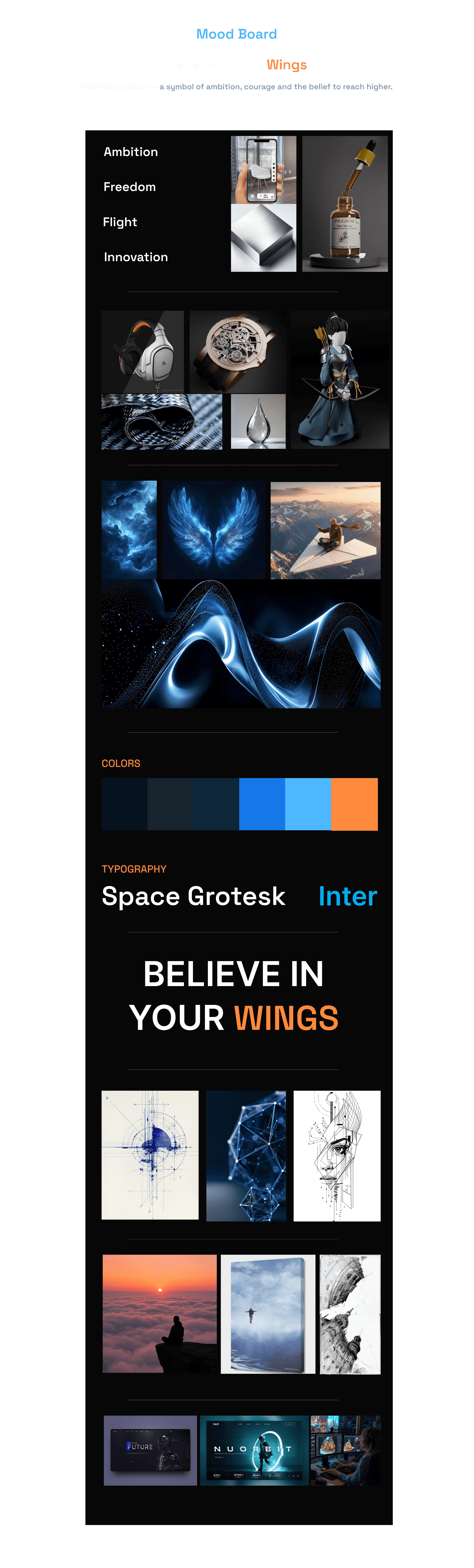
Believe In Your Wings
The visual concept came from the origin of the Ikarus name.
Icarus represents ambition—the belief that you can go higher, attempt something bigger and push beyond what already exists.
That became the emotional foundation of the redesign:
BELIEVE IN YOUR WINGS
Not as a literal aviation theme.
But as a metaphor for what Ikarus does:
Ideas take flight.
Technology gives them form.
3D brings them to life.
The theme and its keywords—Wings, Flight, Freedom, Beginning, Ambition, Faith and Belief—were established as the project's visual foundation.
The Visual Language
From "tech company" to "3D studio."
The redesign needed to feel technological without becoming another generic neon-tech website.
The visual direction therefore combines:
Darkness → sophistication
Light → possibility
Blue → technology and ambition
Orange → energy and action
3D objects → craftsmanship
Movement → flight and transformation
Whitespace → confidence
Redesigned UI
Design System
Typography
Space Grotesk × Inter
The original direction used Gotham, chosen for its geometric, bold character.
During refinement, the typography was pushed toward a more contemporary pairing:
Why Space Grotesk?
Its geometric character gives the interface a modern, technological personality without becoming overly futuristic.
The result is a deliberate contrast:
Personality in the headline.
Clarity in the details.
Colors
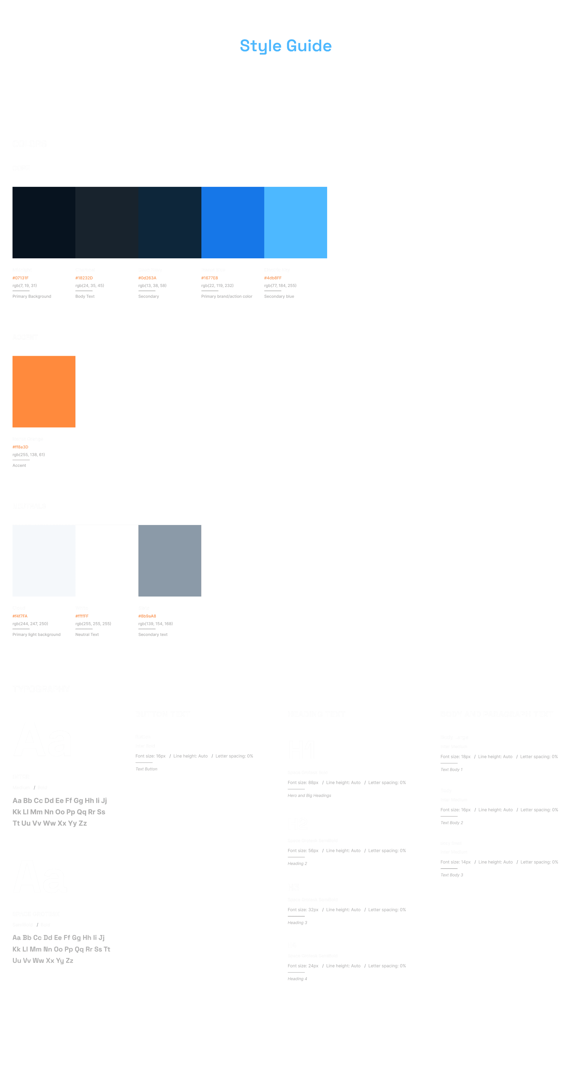
The original brand direction established blue as the primary theme and orange as the accent.
The final visual direction develops that relationship into a darker, more cinematic palette.
Core
Midnight — #07131F
Deep Navy — #0D263A
Brand
Ikarus Blue — #1677E8
Electric Sky — #4DB8FF
Accent
Icarus Orange — #FF8A3D
Neutrals
Cloud — #F4F7FA
White — #FFFFFF
Slate — #8B9AA8
Why blue?
Your project deliberately chose blue because it is part of Ikarus's Greek-blue identity and communicates growth and ambition.
Blue creates the technological foundation.
Orange is deliberately restrained so that when it appears, it signals energy, movement or action rather than becoming visual noise.
Iconography
Sharp + unfilled
Why?
To replace the inconsistent icon language with a unified visual system.
Before → After
From scattered information to a connected story.
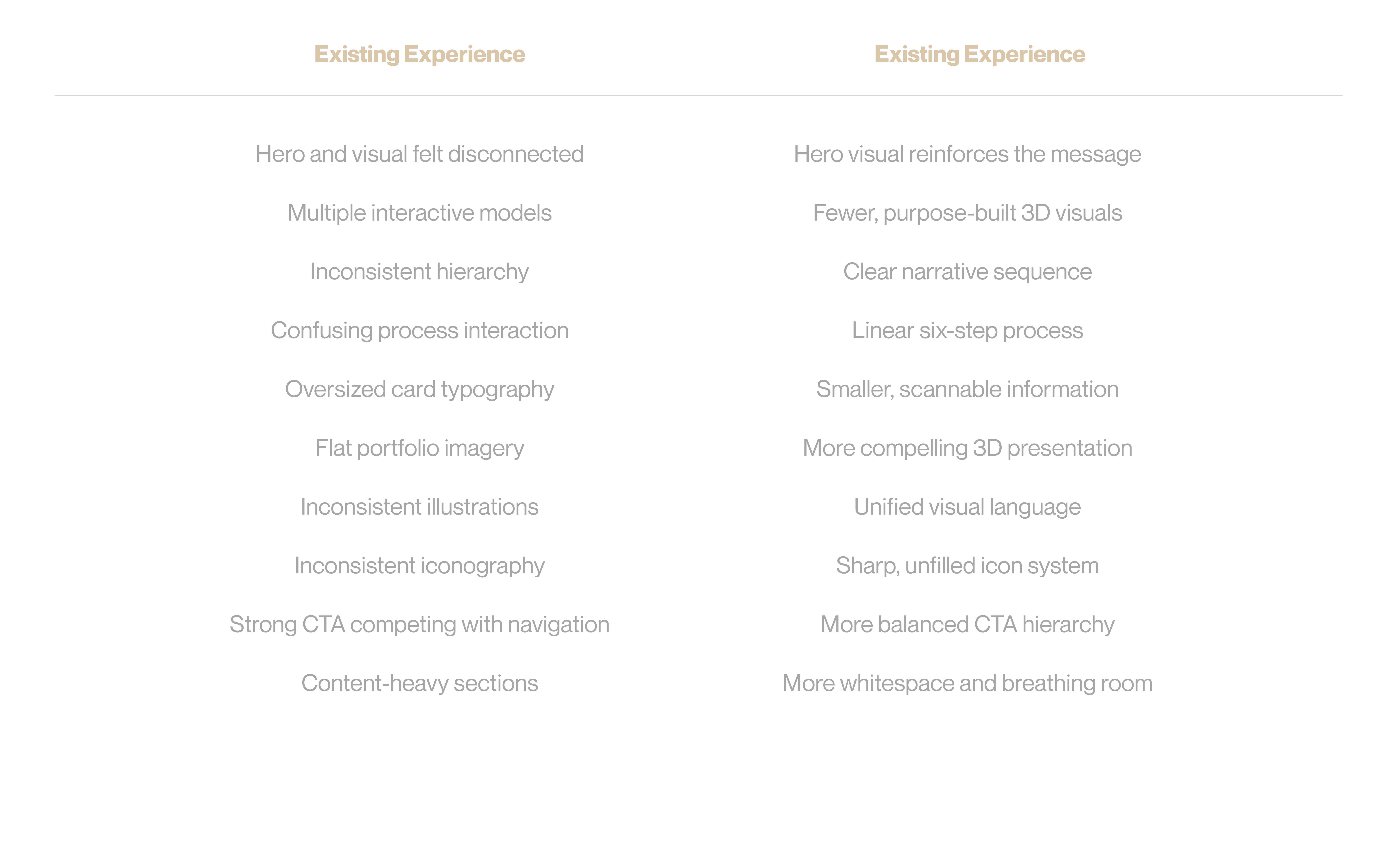
The audit identified these areas as the principal opportunities for improvement.
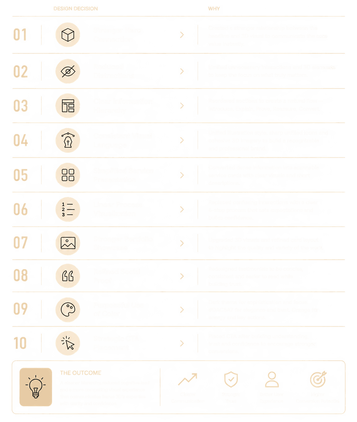
Design Decisions
The Design Principle
Don't make the visitor work to understand the work.
The biggest change wasn't the color.
It wasn't the typography.
It wasn't even the new 3D imagery.
It was the sequence.
The redesign creates a deliberate progression:

That's what turns a collection of website sections into an experience.
The Outcome
A more focused landing page for a more ambitious brand.
The redesign brings together:
a clearer information hierarchy
a stronger hero proposition
purposeful 3D art direction
a consistent visual language
restrained interaction
stronger service discoverability
clearer social proof
a simpler process narrative
more deliberate conversion points
Looking Back
The redesign wasn't about making Ikarus look more futuristic.
It was about making the quality of the company easier to perceive.
The original site already had the right ingredients.
The redesign gave those ingredients:
a hierarchy,
a visual language,
a rhythm,
and a reason to appear where they do.
And the final idea comes back to where the project began:
Believe In Your Wings.
Because Ikarus isn't simply creating 3D models.
It's helping brands take ideas that exist in their imagination—and give them another dimension.
Available